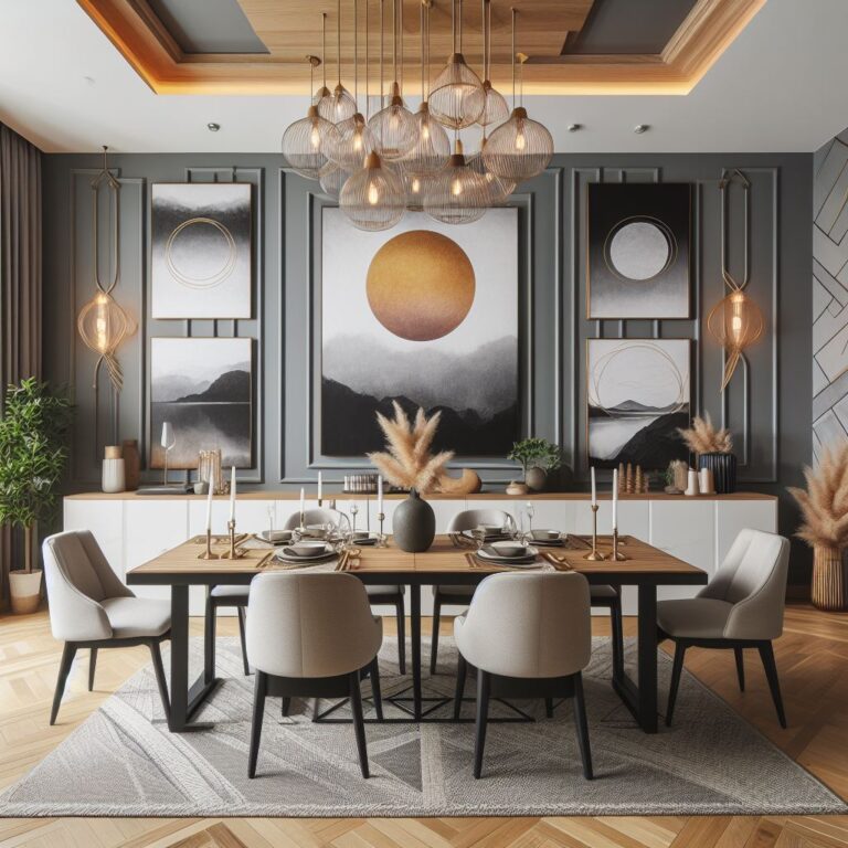
Best Color Combination For Living Room Wall
The living room, a vital space in your home, serves as a sanctuary for relaxation, entertainment, and quality family time. Thus, selecting the appropriate color scheme for your living room walls is essential, as it significantly influences the room’s ambiance.
Choosing the right color combination can seem daunting with the plethora of options available. The goal is to craft a living space that not only mirrors your personal style and preferences but also harmonizes with your furniture, decor, and lighting.
This blog post aims to guide you in finding the ideal color palette for your living room walls. We’ll discuss the importance of color choices, highlight current trends in living room color schemes, and offer tips on integrating them into your living space.
Whether your taste leans towards bold and dramatic, gentle and tranquil, or somewhere in between, we have the perfect color combination recommendations. Join us as we explore how to elevate your living room into a breathtaking and fashionable area.
Why Color Combination Matters for Your Living Room
Choosing the perfect color combination for your living room walls transcends pure aesthetics. It plays a pivotal role in influencing the mood, ambiance, and overall functionality of the space.
In this discussion, we’ll delve into three key reasons why the color scheme of your living room is of utmost importance: its psychological effects, its ability to alter perceived room size and shape, and its capability to harmonize with your decor.
The Psychological Impact
Color wields a profound influence on our emotions and actions. Various hues can trigger a range of feelings and associations, be it warmth, serenity, vitality, or creativity.
For instance, blue is often linked with tranquility and calm, while red is associated with energy and passion. Consequently, selecting an apt color combination for your living room can aid in crafting the desired atmosphere. You might choose a palette that reflects your personality, intended ambiance, or prevailing mood. For a cozy, welcoming vibe, a warm palette of brown and orange could be ideal. Alternatively, for a more dynamic, inspirational setting, a vivacious blend of yellow and purple might be more fitting.
Enhancing Room Size and Shape
Color perception can significantly influence how we perceive the size and shape of a room. Different shades can create optical illusions, making a space seem more expansive, compact, broad, or elongated. For example, light shades tend to make a room feel airy and spacious, whereas darker tones might imbue it with a cozy, intimate feel.
Therefore, the right color choices can accentuate your living room’s best features. Pick a palette that complements the dimensions of your room. If your living space is on the smaller side, a light and neutral mix of white and beige can offer an illusion of expansiveness. Conversely, for a long and narrow room, a deep combination of navy and burgundy can lend a sense of balance and proportion.
Complementing Your Decor
Color also plays a crucial role in achieving harmony within your decor. Different hues can affect how your furniture, accessories, and lighting interact, offering effects that range from highlight to blend or contrast.
For example, complementary colors can craft a dynamic visual contrast, while analogous colors can ensure a smooth and cohesive look. Choosing the right wall color can thus complement and enhance your decor. Whether you seek to match or contrast with your environment, such as your sofa, rug, or curtains, the color palette holds the power to transform your living space. Selecting a green and white combination like sage and ivory can evoke elegance, especially with a green sofa, while a blend of charcoal and coral can infuse life into a space adorned with a grey rug.
Trending Color Combinations for Living Room Walls
Understanding why color combinations are crucial for your living room is one thing, but figuring out which trends are currently making waves is another. In the following section, we’ll dive into three of the trendiest and chic color combinations that promise to transform your living area. Whether your aesthetic leans towards understated elegance, bold beauty, or serene retreat, we’ve identified the ideal palette for your space.
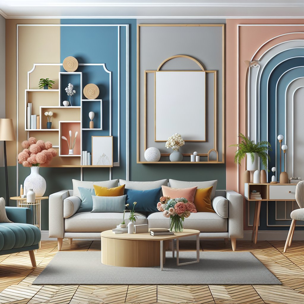
Neutral Elegance: Soft Grays and Warm Whites
The timeless appeal of soft grays combined with warm whites presents a classic color scheme for living room walls, embodying neutral elegance. This pairing complements any decor style and fits rooms of any size, making your space appear both more expansive and inviting. It exudes sophistication and has the added benefit of flexibility, easily incorporating accent colors such as blues, greens, or yellows to personalize your living area. Notable paint selections include Benjamin Moore’s Classic Gray and Simply White, which exemplify this chic and versatile combination.
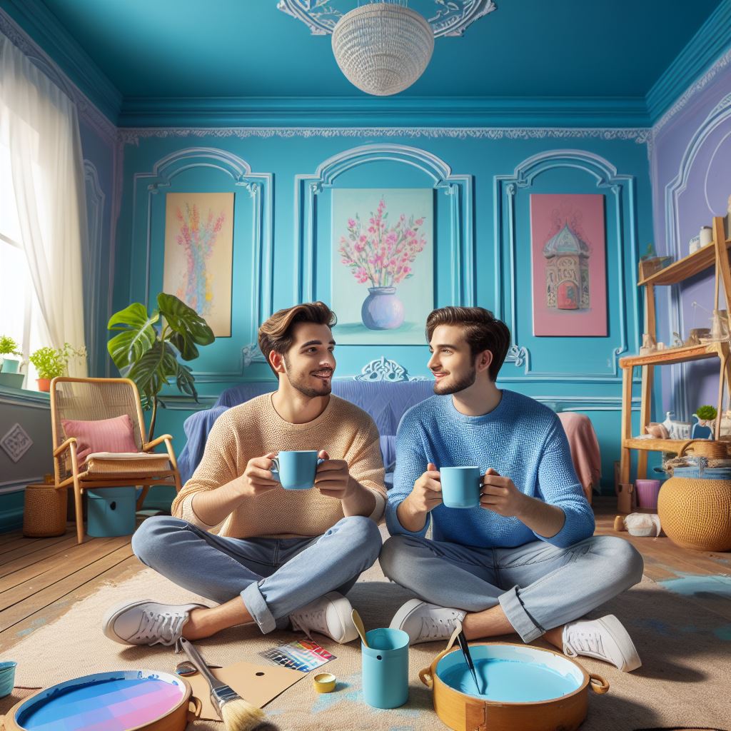
Bold and Beautiful: Navy, Cream, and Mustard
For those aiming to make a striking statement and infuse their living room with a dose of drama, the combination of navy, cream, and mustard is a splendid choice. This vibrant trio is both bold and beautiful, offering a dynamic contrast that’s sure to captivate. It not only brings a cozy and welcoming atmosphere but also injects your space with vivacity and a touch of color.
Complementing a variety of textures and patterns, from plush velvet and sleek leather to intricate florals, this scheme encourages depth and richness within your decor. Top paint options include Farrow & Ball’s Hague Blue and Wimborne White, ideal for those seeking a dramatic yet elegant ambiance.
Calming Retreat: Sage Green and Earthy Browns
For a color combination that promotes relaxation and tranquility, consider sage green paired with earthy browns. This soothing duo fosters a calm and serene atmosphere, reminiscent of nature’s serenity. It harmoniously balances your living space, infusing it with a fresh and warm vibe. Additionally, this palette supports the integration of natural materials like wood, stone, or greenery, enhancing your room with texture and vitality. Excellent paint choices for this calming retreat include Sherwin-Williams’ Contented and Accessible Beige, anchoring your living space in tranquility and organic beauty.
Incorporating Color Combinations into Your Living Room
Discovering the impact of color combinations on your living room and exploring trending color schemes are your first steps. Now, it’s about bringing those color combinations into your space effectively. This segment provides actionable advice on weaving colors into your living room that align with your personal taste and budget constraints.
Whether your canvas is blank or you’re elevating existing elements, these straightforward steps will help you craft a living room that’s a true reflection of you.
Starting with a Blank Slate
Having a blank canvas offers the freedom to select any color palette for your living space. Nonetheless, the vast array of choices can also feel intimidating.
To simplify your decision-making process, consider these guidelines:
- Find your inspiration: Gather ideas from images, magazines, or websites showcasing living rooms that resonate with your style. Utilize online tools like [Canva Pro] to experiment with color palettes and visualize their synergy.
- Choose your main color: Pin down the primary color to define your living room’s ambiance. Whether driven by preference, mood, or functionality, this color lays the groundwork. For a serene setting, you might lean towards blues or greens.
- Choose your secondary colors: Select one or two colors to complement or contrast your main hue. Draw inspiration from color theory (complementary, analogous, triadic) or go with your gut. For instance, pairing navy blue with cream and mustard could be striking.
- Test your colors: Before finalizing, test your chosen colors in smaller areas or with samples to observe how they interact with light and furnishings. Digital tools like [Benjamin Moore’s Color Portfolio App] allow for virtual trials, offering a preview of the finished look.
Accessorizing with Colors
Painting isn’t the only route to infuse color into your living room. Accessorizing offers a flexible and easily changeable way to bring in different hues. Here are some accessorizing tips:
- Colorful pillows and throws: An affordable and simple method, colorful pillows and throws can instantly add character and comfort to your space. Mix colors, patterns, and textures for an inviting atmosphere.
- Colorful rugs and curtains: Rugs and curtains not only inject color but also define areas, add warmth, and serve as visual anchors. Choose items that either complement or contrast with your existing setup, or introduce an entirely new color theme.
- Display colorful artwork and accessories: Artwork and decorative accessories are perfect for personalizing your space with colors and themes you love. Incorporate paintings, prints, sculptures, or even colored vases, lamps, and plants to introduce vibrant touches and personality.
Mixing Patterns and Textures
Effective color incorporation in your living room goes beyond color selection—it’s also about the artful blend of patterns and textures. This approach brings depth, interest, and vitality to your space.
Here’s how to mix patterns and textures effectively:
- Use a common color: For a cohesive look, anchor your designs with a common hue present across all patterned and textured elements. This unifying color, whether a primary or secondary shade, should feature in items like pillows, rugs, and art pieces.
- Vary the scale: Prevent visual clutter by balancing pattern and texture sizes. Opt for larger patterns in focus areas and smaller ones for accent pieces. A harmonious mix keeps the space dynamic yet orderly.
- Balance the contrast: Aim for a pleasing visual equilibrium by moderating the contrast levels in your patterns and textures. Statement pieces can afford more dramatic contrasts, while background elements should be subtler, ensuring an overall balanced aesthetic.
Conclusion
We’ve guided you through the journey of discovering the perfect color blend for your living room walls, illustrating the significance of color combinations, showcasing trending hues, and providing strategies for their integration. It’s our hope that this post has enriched your knowledge and sparked inspiration for crafting a living space that truly resonates with your unique style and preferences.
Now, the ball is in your court. Whether you’re inclined to repaint, add colorful accents, or mix patterns and textures, you’re equipped with the insights needed to transform your living room into an eye-catching and fashionable haven.
Embrace the freedom to explore and enjoy the process of mixing colors. After all, the best color scheme is the one that brings you joy and comfort.
So, why wait? Seize your paintbrush, cushions, or art pieces, and infuse your living room with vibrant colors starting today.
The impact can be astonishing, and we’re eager to witness the beauty of your living spaces. Don’t hesitate to share your transformations with us – your stunning living rooms are what we look forward to seeing.